Colors have the power to influence our emotions, thoughts, and even behaviours. Whether we’re aware of it or not, the colours around us play a significant role in shaping our moods and perceptions. This fascinating phenomenon, known as color psychology, has been studied for years, and it reveals that different hues can evoke specific feelings, trigger memories, and even impact our productivity. If you’re looking to use color to enhance your environment, here’s a breakdown of how different colors affect your mood and well-being.
- Red: Energy and Passion
Red is a powerful and stimulating color that is often associated with strong emotions like passion, love, and excitement. It’s a color that grabs attention and can raise energy levels. In a room, red can create a sense of urgency or increase heart rate, making it ideal for spaces where activity or excitement is desired, like a living room or dining area. However, too much red can feel overwhelming or aggressive, so it’s best to use it in moderation. Red accents, such as a throw pillow, wall art, or a rug, can add warmth and energy without being overpowering.
- Blue: Calm and Tranquility
Blue is known for its calming and soothing qualities. It’s often used in spaces where relaxation and peace are the main focus, such as bedrooms and bathrooms. This color is linked to feelings of serenity, trust, and stability. Blue has been shown to reduce stress and promote a sense of tranquillity, which is why it’s frequently used in environments like hospitals and spas. Lighter blues, such as sky blue, can evoke feelings of open spaces and freedom, while deeper blues, like navy, may bring a sense of sophistication and calm.
- Yellow: Optimism and Happiness
Yellow is a bright and cheerful color that can instantly lift your mood and bring a sense of happiness. Often associated with sunshine, warmth, and positivity, yellow is a color that can help to stimulate creativity and promote a sense of joy. It’s a great choice for kitchens, dining rooms, or any space where you want to create a lively, welcoming atmosphere. However, too much yellow, especially in its brighter shades, can become overwhelming or even irritating, so it’s important to use it in balance with other colors. Soft yellows or pale golds are excellent choices if you want to maintain a sense of warmth without overstimulation.
- Green: Balance and Nature
Green is a color that symbolizes nature, growth, and balance. It’s often associated with renewal and fertility, bringing to mind the calming effects of nature. Green is said to have a soothing and restorative effect on the mind, making it a perfect choice for spaces meant for relaxation and rejuvenation. Whether it’s the deep green of a forest or the soft hues of mint, this color promotes a sense of harmony and well-being. It’s a great option for living rooms, bedrooms, and even home offices. Green is also known to help with focus, making it ideal for study areas or creative spaces.
- Orange: Enthusiasm and Warmth
Orange is a warm, energetic color that is known for promoting enthusiasm and excitement. It combines the energy of red with the cheerfulness of yellow, making it a vibrant and lively color choice. Orange can stimulate communication, creativity, and social interaction, making it a great option for spaces designed for entertaining or socialising, like living rooms or dining rooms. However, much like red, too much orange can feel overwhelming, so it’s best used as an accent color rather than the main tone. Shades like peach or terracotta are softer and can add warmth without being too intense.
- Purple: Luxury and Creativity
Purple has long been associated with royalty, luxury, and creativity. This rich, deep color can evoke feelings of sophistication, elegance, and mystery. Lighter shades of purple, such as lavender, are more calming and soothing, while darker purples can evoke a sense of drama and richness. Purple is often used in spaces that benefit from a touch of luxury, such as bedrooms or home offices. It’s also a great color for stimulating creativity and inspiring imagination, which is why it’s often found in art studios or creative spaces. If you want to create a sense of opulence or mystery, incorporating purple into your decor can be a great way to achieve that.
- Pink: Love and Compassion
Pink is a color that is often linked to feelings of love, nurturing, and compassion. It has a soft, calming effect that can create a peaceful atmosphere in any space. Lighter shades of pink, like blush or baby pink, promote warmth and comfort, making them ideal for bedrooms or spaces where relaxation and intimacy are key. Deeper shades of pink, such as fuchsia, can be bold and energetic, evoking feelings of confidence and strength. Pink is also associated with kindness and affection, making it a lovely choice for areas where you want to encourage harmony and connection, like living rooms or family rooms.
- White: Purity and Clarity
White is often associated with purity, simplicity, and clarity. It has a clean, fresh feeling that can make a space feel open and airy. White is an excellent choice for creating a minimalist or contemporary look, and it can help to brighten up smaller spaces by reflecting light. It’s often used as a neutral backdrop to allow other colors to shine. While white promotes feelings of calm and peace, too much white can feel sterile or cold, so it’s important to add warmth through accessories, textures, or other colors. It’s especially effective in spaces where you want to evoke a sense of clarity or freshness, such as bathrooms or kitchens.
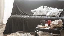
- Black: Sophistication and Mystery
Black is a bold, powerful color that can evoke sophistication, elegance, and mystery. It’s often used in interior design to create dramatic contrasts and add depth to a room. When used sparingly, black can make a statement and add a sense of luxury or refinement. In furniture and accents, black can be chic and timeless, complementing other colors beautifully. However, too much black can create a feeling of heaviness or gloominess, so it’s best used as an accent or in combination with lighter colors. Black is ideal for creating a sleek, modern aesthetic, making it perfect for dining rooms, home offices, or even accent walls.
- Brown: Stability and Comfort
Brown is a grounding, earthy color that symbolizes stability, comfort, and reliability. It’s often used in interiors to create a warm, welcoming atmosphere. Brown hues, such as chocolate, beige, or taupe, evoke a sense of warmth and security, making them ideal for creating a cozy, inviting space. This color pairs well with natural textures like wood, leather, and stone, making it perfect for living rooms, dens, and bedrooms. Brown can also promote relaxation and reflection, making it a good choice for spaces where you want to unwind after a long day.
Conclusion
The colors in your environment have a profound impact on how you feel and interact with your space. Whether you’re looking to feel calm, energized, creative, or inspired, understanding the psychological effects of different colors can help you make informed choices when decorating your home. By selecting the right colors for each room, you can enhance your mood, improve productivity, and create a space that truly reflects your personality. So, whether you prefer soothing blues or vibrant reds, use color to create the atmosphere you want to experience in your home.